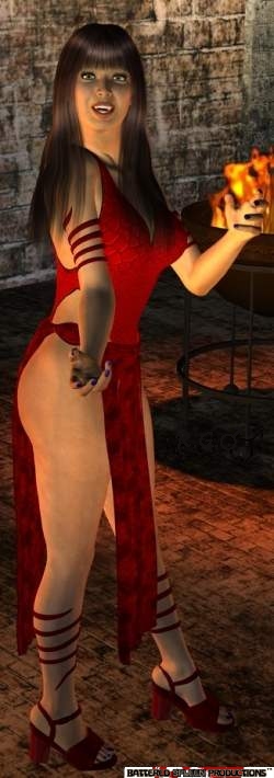
Come learn the art of 3D computer generated art and animation. This blog deals with the lessons learned and the art created by Robert G. Male using DazStudio from Daz3D.
Also covered are the ancillary software, tools, techniques, and processes needed both before and after rendering in the 3D software.
R.M.T.P. Co. is a
company dedicated to quality
Web products without all of
the unnecessary hype. Our
products speak for themselves. Down to earth, easy,
usable, these are the principles
we believe in.
Today's cover, for an album following relatively close on the heels of yesterday's cover, is the next in the continuation of Derek Riggs covers for the band Stratovarius. The album in part one of a two-album project called Elements. If this run of covers is connected in the way that I have asserted then most assuredly these two covers are nearly as one. They form a contrast between each other, and are something of a yin and yang, and act as the two sides of the same coin, a dichotomy.
The Elements Pt. 1 cover is water and fire. A woman of water, with fire that burns within, rises from the ocean. A thin golden Möbius strip surrounds her. Held aloft is the band's chosen symbol, a fleur-de-lis. Just to tangent a moment, I have no idea why the band chose this as an emblem because the band is from Finland and I cannot help but identify the fleur-de-lis with the French. Anyway, the fleur-de-lis is formed of amber that is flaming and streaming light. Fluffy white clouds stretch as far as the eye can see, seemingly rising straight up from the ocean along the horizon. It is a stunning picture that just screams triumph and exemplifies unbridled power. Spectacular.
The next Stratovarius cover by Derek Riggs is for the album Intermission. The cover draws on elements of not only the previous album art, his own, but also previous covers by other artists. Very fitting decision since this album represents a couple of songs from previous albums plus cover songs collected from those previous eras of the band. I cannot say if these cover songs were recorded back in the days of the band's previous albums or if they are just indicative of those times for the original bands.
This cover is very cosmic-y and fantastical in a form very representative of the band's music and lyrical outlook. It also almost seems like a set-up for the next albums, which is technically possible given what I know of the release schedule and planning. It also follows the Infinite album's theme. What is past, and what was to come involves a dichotomy of light and darkness and the struggle between the two sides. The contrast between the two would seem to be the point of all these covers. Yet it is not repetitious and is more like the kind of progression I'm used to seeing when Riggs is involved. It may be him, it may be the bands, but I can see it being a symbiosis.
I thought I'd go back to just regular album covers now. The first band that came to mind was one called Stratovarius that I really like. Some of their most recent album covers have been just stunning. I found out today why that is. These covers are being done by none other than Derek Riggs. Today I want to talk about the cover from the band's album Infinite. It shows two cities on seemingly two different worlds, as evinced by the appearance of other planets in the sky of the one on the right.
While the cities themselves look very similar, the oceans of the two are vastly different, one pristine, bright, and full of life, the other one befouled, dark, and deadly. Superimposed over these two vistas is a golden Möbius strip in the shape of the symbol for infinity. Gold dolphins leap through the "hoops" of the strip exchanging worlds. Lightning strikes, or perhaps even forms the strip, the "holes" of which are filled with energy in a form almost like water. It is a wonderful piece of artwork with its own story, again like so many of Riggs' works, enhancing the album to which it belongs.
It's kind of funny how these things appear in runs, and not just solely by my selection process. The next art album cover I wanted to talk about is an interesting piece, again chosen by Bruce Dickinson, and again it is on a follow up album, not including live or best of collections. The album is titled A Tyranny of Souls. The cover art is a work by renaissance artist Hans Memling. It is the right "wing" of a triptych called Earthly Vanity and Divine Salvation, done circa 1485. A triptych in this case, and I had to look this up, is a work consisting of three painted or carved panels that are hinged together.
The panel chosen for the album depicts a rooster-footed, bat-winged devil (perhaps The Devil) with a second face in its chest, stuffing people down the gullet of a giant snake. Over top of the devil is a banner that reads "in Inferno nulla est redemptio" which means "in Hell there is no redemption". The piece is cut off for the cover just below the devil's lowered knee. Also part of the banner is cut off and the words have been removed. There is a banner added below though, with the album title. The original art is fairly awesome as far as these kinds of work go for me. As far as the connection between the cover and song, I don't really feel it, but I felt the cover worth a blog about.
A thought occurred to me the other day and here is the result. Some album covers can be actual art. By that I mean, previously created art, as opposed to something done specifically for the album. The first of these "art covers" I wanted to talk about is the one chosen by Bruce Dickinson for one of his solo albums. The piece of art in question is called "The Ghost of a Flea" by William Blake, and the album is The Chemical Wedding. It is a fitting choice of artist given that some of the songs are inspired by the writings of William Blake. Just for reference the painting was done circa 1819.
The cover is not the entire painting. A wood frame has been added to the picture, and a pair of stars has been removed. The background has been mostly blurred out with a motion blur resulting in turning it into lines radiating out from the central figure of the ghost. This blur effect is the type that gives the picture a sense of being seen through inhuman eyes. It is the kind of thing seen in movies where the scene is seen through an alien's eyes for example, or sometimes a supernatural predator. In this case, based on discussion available about Blake's thoughts on the painting, I have to guess a real flea is seeing the figure.
There is one thing I haven't commented on while talking about album covers. It is the idea that bands have their own fonts. These fonts are used pretty much exclusively for the band's name. Not all name fonts are created equally. There is a certain style that carries over in groups of band names based solely upon their genere. As such there can be huge parallel's drawn between them in many cases. The hard rock and metal genre is just such a genre with these parallel styles.
It is only incidentally as far as my selections are concerned that the two bands I've talked about share very similar fonts. The Def Leppard font and the somehow more iconic Iron Maiden font are very similar. With both bands first albums coming out in 1980, and no idea about what sort of banners they may have used in live shows prior to be signed by a label, I find it safe to hypothesise that there is a common root within some older band's font. Def Leppard's and Iron Maiden's fonts are certainly more comparable than similar but more varied fonts like those of say Kiss or Twisted Sister.
When I first thought of talking about album covers I immediately saw in my mind's eyes, the Iron Maiden covers I already talked about, and also one other cover that stood out just as starkly in my mind. This meant that it held an obvious weight. The cover is for the Def Leppard album Hysteria, and Andie Airfix of Satori did it, according to wikipedia. It is a cover that is definitely iconic. I can only assume that anyone who knows of the band in more than a passing fashion has to know that cover. I might also further suppose that people interested in album cover art must know it as well.
The cover is hugely emblematic of the idea of hysteria. The style influences in the artwork, the ones that direct it, are culled from the music itself. I can also see parallel's to the band's font as well as the triangular badge seen on the band's first album. As for the picture as a whole, I make an immediate connection to the movie Tron, and a scene from Transformers the Movie. It also reminds me of something I can't place a name to, an image in my head of a figure and lines of lights coming on around it, a very similar feel to the light-lines of this cover. I just can't seem to place it.