Come learn the art of 3D computer generated art and animation. This blog deals with the lessons learned and the art created by Robert G. Male using DazStudio from Daz3D.
Also covered are the ancillary software, tools, techniques, and processes needed both before and after rendering in the 3D software.
R.M.T.P. Co. is a
company dedicated to quality
Web products without all of
the unnecessary hype. Our
products speak for themselves. Down to earth, easy,
usable, these are the principles
we believe in.
I was doing some preliminary work on a new web page design. There really are a million and one things to choose and to keep in mind visually. I think one of the biggest differences between this kind of work and say painting, is that you just cant apply the web elements in a single stroke. Each stroke of the bigger picture is made up of a bunch of directions. I think about the only saving grace is that the web page requires a tremendously lesser amount of strokes necessary. That is aside from the fact that some directions for the strokes can be unified and declared all at once. So while it may take less time it doesnt lessen the number of decisions required.
Essentially what Im talking about is art direction. Thankfully it is something of which I feel I have a fair grasp. I think ever since I was first introduced to the act of creating somethingwhich is as far as I am concerned is automatically an artistic pursuit regardless of if it turns out to be ArtI felt that I had a sense of direction for it, even if I couldnt necessarily do the best work myself on the actual art. We always start off with visual arts or maybe its a tie with vocal artsinging. Then we find out about music, which grows out of the vocal. Then comes the written word. That is where I found my niche, but it doesnt stop me from dreaming about the other two styles. I just have to admit I have it bad.
I was talking with someone today about the design of their website and how they didnt like what they had. Part of the problem was manpower, not something I can do. Part of it was technical, something I know about up to a point. Part of it was the header at the top of the site. Now, as usual, this header was the logo for the group whose site it was. Right off the bat there is only so much I could do there myself, and for the most part it wouldnt be any better than what they had, if it didnt actually turn out worsedepending on what they wanted to do to fix it. I pointed out, in my educated (95% experience 5% learning) opinion, that this header, this logo, is vital to the design of everything else.
What this means, and I explained to them, is that the rest of the page echoes, parallels, and/or riffs off of the logo. Everything, from the style of all the visual elements to the colour schemes for everything, is dependent upon this anchor. The logo is not only the anchor of the page but also is the online anchor for the group to which it belongs. It is the first and foremost impression-making thing they have. It is them distilled into a picture. So that is their starting point. After that the rest is mostly a matter of doing it, and the tonne of back and forth to design the site to their tastes after they provide all of the materials to the new web designer. I find it an interesting process.
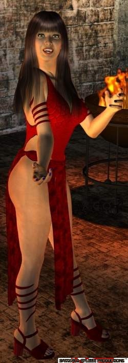
I take it from a number of the discussions Ive read, and the tutorials that Ive looked into, that a number of people further embellish their 3D rendered scenes in a secondary program such as Photoshop. More tools have come out to do some things within the Daz program, things that would be incredibly hard to do after the fact, if not pointless to attempt, even if possible. I know I certainly think its a splendid idea. Before all of the settings started coming out in the freebies I took a couple simple renders and pasted them over a photo background. It was something I did for quite a while with other peoples artwork. Id show them off, but I am sensitive to breaking copyright even benignly because I hope to be given the same sensitivity with my writing.
Still, as a hobby, and for personal non-profit, non-disseminated use I did a number of pieces. I took several elements from different places and different artists and I resized them, flipped them around, turned some at angles and put them together into a tableau or scene. Sometimes, for extra fun, Id do little animations. Sometimes my scaling was off, sometimes angles were odd or physically impossibleespecially when only changing an angle on one part, like turning a headand there is a certain lack of reality when merging B&W line drawings or cartoons with real backgrounds. One of the greatest things for me about Daz is the ability to do away with impossible turns of parts and bad scaling issues, though those can still be tricky depending on what youre putting with what.
Today I have no artists. What I do have is a question I have to go seek out an answer to, a question that came to me recently. I started work on a picture in Daz to put up in my gallery. I dont know about accessibility to it, but I have a picture in my private section of the gallery, a piece I composited together from images I dont own the rights to, which is why it just isnt out in the public. From what Ive learned anyone on your list of friends can access youre private section unless theres three sections I forget. Anyway, back to what I was doing. I was creating a scene in Daz when I suddenly asked myself, How do I get the picture out of Daz into a .jpg, .gif, or other format to put on Artzone?
I looked around the menus and found out how to save the render in .jpg format. Good stuff. Except the picture I end up with is only the resolution of my screen in Daz with the control boxes closed or otherwise minimised. So Im left with the question how do I get a bigger picture out? I am really loath to increase my monitors resolution because doing so makes it loose the width and height of the desktop, requiring me to stretch them. Most of the time returning to a resolution that Ive stretched sets things to right, but this monitor has some age related issues, and it will lose the settings if I change resolutions more than a couple times. If anyone can tell me what to do in Daz to get bigger renders please do so, and Ill start digging into tutorials to see what I can find (when I have time). Thanks.
Now we come to the last, but by far not the least, artist of Palladium that I want to talk about. At this point I have something of a fear that he is going to be forgotten as an artist. He doesnt take much time for visual art any more. Hes too busy with writing and running a businesssadly more of the latter than the former. Who is this virile vulcanized Viking of visionary vigour? Its the companys creator, owner, whiz-bang million-jobs-at-once, Kevin Siembieda, or as I call him fondly, KevSim. KevSim wanted nothing more growing up than to be a comic artist. When opportunity presented itself he jumped at the chance and produced his own comic-line/series. Fate had other plans for the young man though fate and a place called the Detroit Gaming Center changed that forever.
In some of the early books it can be hard to tell who drew what, as not all pictures have a signature on them. There is one area that I want to declare KevSim the king of, and that is the ugly people. Seriously. I do not mean badly drawn, in fact I love them, the detail is excellent and they are exceptionally drawn, but the people are often butt-ugly. These are some of the homeliest people on the planet, and those are the humans, never mind the ugly races like Ogres, Trolls, Goblins, and such! LOL. Some pictures of his that I love are his Basilisk, and his Devilkin, which sadly I havent seen reprinted and seems relegated to its appearance in the first edition PF core book. Ive noticed a couple colour covers that KevSim has done, the most recent The Rifter #35 Special Swimsuit Issue, and while not bad, I think he should stick with his B&W illustrations.
While looking for some samples of Burles for yesterdays blog I ran across another interior artist that I thought I should talk about. This artist doesnt have a long resume according to the website Ive been getting my information from, and there is nothing more recent than 2001. Its anybodys guess as to why that is, well, unless someone knows something. His name is Jim Lawson and it would appear that he has worked with Peter Laird of TMNT fame. There are a couple of Lawsons pictures in the Coalition War Campaign book that have Laird written beneath the Lawson sig. Since the other two books to Lawsons name are After the Bomb booksan offshoot of Palladiums TMNT books, which were of course inspired by Eastman and Laird in the first placeI can only make the connection that its The Laird.
It would appear that on January 19th I made a mistake. I cannot find any incidence of Vince Martin drawing a Spiny Ravager. Oh failing memory, how you burn me. An artist named Britt Martin did the colour Ravager for the short-lived Rifts CCG, hence the confusion. The line drawings of the Ravager are Jim Lawsons in the CWC book. There is an action shot with two Deadboys attacking one that says Lawson and Laird, and the still shot of just the beastie says only Lawson. This means Lawson rocks! In addition, in the same book it was Lawson who gave us the look of all of the D-bees and monsters. Also in there are some Dogboy pictures that are really cool, though admittedly in style maybe a step behind Martins one picture of them. Lawsons work in here is much different than his almost cartoonish mutant animals in the After the Bomb book. Not that those werent fitting where they were used.
I thought for a change of pace that I would actually talk about one artist of which Im not really a fan. His name is Kent Burles. There can be no doubt that Burles puts the effort into the work, does a fair bit of work for Palladium and in the industry in general, and he must be a nice guy. His style is easily spotted, but I think Ill hold off on the distinctive tag because I have seen similar. His style is easily described I think by one word, charcoal. It may not be the media he uses but that is exactly what it puts me in mind of whenever I see it. Its not really, blurred, or smeared, but you get that impression. Its maybe the first negative, at least when compared to my preference for crisp lines, cross-hatching, and other tight/highly detailed styles.
If you want a landscape I can see getting Burles to do it. Theyre not bad. I can see how some people might like them in his style. If you want a portrait Burles can do it, and they dont look bad, but again, theyre not my personal preference. His architecture is where I begin to dislike his work. There are a lot of protuberances and other odd and pointless bits. This leads to where I begin to hate his work. People with armour, medieval or modern, have these protuberances and weird improbable headdress-like helmets. Then on those odd occasions where theyve seen fit to ask Burles for pictures with technology in them you get even weirder and more improbable and useless things added. I dont like it, and I dont want it. Obviously though, since every Palladium decision is his, Kevin Siembieda likes Kent Burles work. That must count for something as far as Im concerned.