Come learn the art of 3D computer generated art and animation. This blog deals with the lessons learned and the art created by Robert G. Male using DazStudio from Daz3D.
Also covered are the ancillary software, tools, techniques, and processes needed both before and after rendering in the 3D software.
R.M.T.P. Co. is a
company dedicated to quality
Web products without all of
the unnecessary hype. Our
products speak for themselves. Down to earth, easy,
usable, these are the principles
we believe in.
Over the weekend I sat down and created another monster. They are for an RPG project, which for the time shall remain unnamed. It has a name, but I'm just not unveiling it yet. This new monster will join the ranks of one already available for perusal in my gallery, called a Gappon. I have depicted this new monster species in "The Daasandara in the Temple". It is made up entirely of primitives, nulls, and deformers, all with a texture applied. I began the process with certain particular traits in mind for the creature. During the creation different qualities about the creature changed based on my ability in Daz3D, and in perceived needs for the biology of the creature and functionality necessary. The vision I had in mind in changed and with it details beyond the visual.
I started the Daasandara with the intent that they have leather membrane wings. Unlike some flying animals this creature was also to be able to get around on surfaces using it wing tips like feet or hands. Due to the setting of the RPG for which I was designing these monsters many of the surfaces in the places they inhabit would be vertical or near vertical cliff faces. This is why the first thing I put together were the wings. There was also a secondary consideration. I wanted the wings to have the structure and flexibility to wrap around objects; prey in particular. The wings can wrap and constrict. This led to making a more hand-like wing with five fingers. The long extension of the final, membrane-free digit of the wings allows the Daasandara to crawl over horizontal surfaces.
Music: A Perfect Day for Terror by The Survivors of Camp Crystal Lake.
Making shadows with simple light set ups and even simpler backgrounds and horizontal surfaces is fairly easy. Moving up the scale to multiple lights, varied backgrounds and both horizontal and vertical surfaces is a different experience altogether. Two of the easy things remain true in the more complex scene. The best shadows come from spotlights positioned in somewhat close proximity. The shadow is darker if the light is brighter. However, there is one thing that alters this second guideline. Additional lights will lessen the darkness of the shadows partly through lighting the object the shadow falls on brightening it, but also partly by lighting the shadow. To overcome this, the intensity of the spotlight can be increased. This however comes with a price.
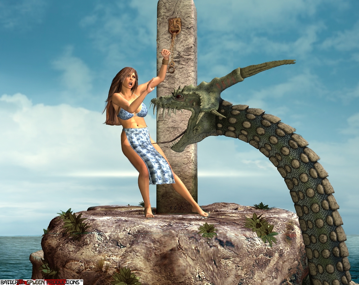
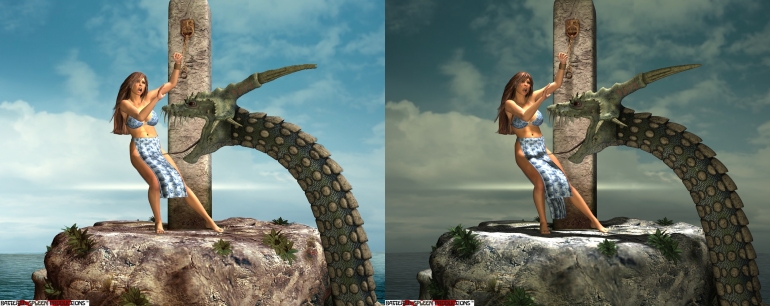
Here is a new image titled "Yearly Appeasement" where I have set the shadows with a single spotlight amongst the other non-shadow enabled lights. There is also a new image titled "Appeasement Comparison" showing a much darker shadow with less light in the scene overall. This comparison shot highlights (pun intended) the problem inherent in turning up the intensity of the shadow light as well as the obvious darkening affect of turning off a light or two. The problem is that parts of the figure the shadow is desired from are too bright and overall the scene looks more like a TV stage kind of scene with obvious lights in it rather than a natural outdoor scene. This also butts up against the issue that I find I have to work around regarding distant lights versus spotlights.
Music: The Silhouette by Winter's Bane w/ Tim Ripper Owens.
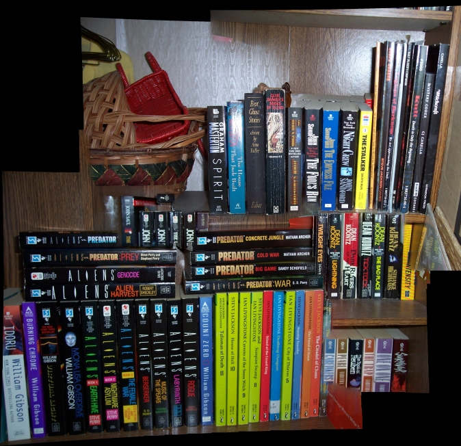
I'd like to carry on from last time. Some forethought needs to be put into taking the photos when the intention is to stitch them together. The stitching process can take several pictures with only minor variation and use them, usually resulting with whatever drift they have vertically or horizontally. It doesn't use what it doesn't need. Extraneous photos in a stream of needed ones like this can cause problems though depending on the shapes that the software uses to differentiate where one photo should begin in the stitch and where it ends within the next one. For many scenic shots there is a lot of detail that can be picked out and create an effective unique fingerprint for the individual photo. Perhaps oddly, trouble can arise from photos with geometric shapes even with distinct colours.
The picture "Bookshelf Whoopsie" is a prime example of what can go horribly wrong. The photos were out of order, and one or two were taken at 90 degrees, all of which should have been a non-issue with everything so squarely defined. That however is the key; those straight edges make it difficult to know what should sit next to what. It is somewhat perplexing though as to why some of the books are cut off, even when it rotated the photos perfectly. It is clear that it could not differentiate the outside border of the shelf, and mysteriously the horizontal shelves are almost entirely missing. Also shown is the way that the Panoramic Photo takes the pieces it needs and throws the extraneous parts away--which wasn't apparent from the clean versions last week.


